
들어가기 이전에
부모 div안에 자식div 세 개를 만들어 보자.
<div>
 <div><div>
 <div><div>
 <div><div>
</div>
시각적 힌트를 위해 색깔과 높이/너비를 주고, 부모 div에 border값을 주겠다.

박스들은 오른쪽 옆 공간을 끝까지 다 자치하기때문에, 우리가 보는 눈으로는 오른쪽 빈 공간이 충분해보임에도 불구하고 다음 행으로 넘어가게 된다.
자 이제 우리가 flex를 사용해서 무엇을 할 수 있는 지 알아보자.
부모에 display:flex를 주자
.parents {
display: flex;
}
기본값인 가로 메인축을 기준으로 item들이 정렬된 것을 볼 수 있다.
Main axis(가로축)와 Cross axis(세로축)는 상대적인 개념이다.
justify-content 속성을 통해 *main 축의 item 정렬을 어떻게 해줄 지 정할 수 있다.
속성의 종류는 flex-start / flex-end / center / space-between / space-around / space-evenly 가 있다.
이 메인 축의 정렬은 기본적으로 row로 설정이 되어있는데,
.parents {
display: flex;
flex-direction: column;
}
이렇게 flex-direction을 column으로 지정해 줌으로써 메인축을 column, 즉 수직으로 바꿀 수도 있다.
felx-direction: row (기본값)
.parents {
        width: 500px;
        height: 500px;
        border: 20px solid black;
        display: flex;
        /* flex-direction: column; */
        justify-content: space-between;
      }
flex-direction: column

.parents {
        width: 500px;
        height: 500px;
        border: 20px solid black;
        display: flex;
        flex-direction: column;
        justify-content: space-between;
      }
justify-content를 ‘가로정렬' 이라고 외우면 안되는 이유가 이거다.
정렬되는 축은 ‘메인 축을 어디로 쓰느냐'에 따라 달라지기 때문이다.
그 외 다른 속성들도 살펴보자.
justify content :flex-start

justify content: space-between

justify content: space-evenly

align-items
이번에는 지정한 축의 반대축으로는 어떻게 정렬할건지 정해야겠지?
그건 align-item property의 속성을 정해줌으로써 할 수 있다.
여기서는 row가 기본축이니, column축을 정렬하게 된다.
align-items: center

align-items: stretch
- 아이템이 말 그대로 스트레칭된다. 여기서는 height값을 정해줌으로써 차이점을 보자.
- 첫 번 째 박스는 300px, 나머지는 100px이다
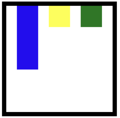
.child1 {
        width: 100px;
        height: 300px;
        background-color: blue;
      }

      .child2 {
        width: 100px;
        height: 100px;
        background-color: yellow;
      }

      .child3 {
        width: 100px;
        height: 100px;
        background-color: green;
      }
정리
.parents {
        중심축을 어디로 할 것인가? 디폴트는 row
        flex-direction: row;
        flex-direction: column;


        중심축을 어떻게 정렬할 것인가?
        justify-content: flex-start;
        justify-content: center;
        justify-content: space-around;
        justify-content: space-between;
        justify-content: space-evenly;


        반대축을 어떻게 정렬할 것인가?
        align-items: stretch;
        align-items: flex-start;
        align-items: flex-end;
        align-items: baseline;
        align-items: center;
      }
이 외에도 flex-warp 이나 align-content: strech 가 있지만, 일단은 여기까지만 알아도 flex 기초는 떼었다고 할 수 있겠다.
'Front-End Developer > CSS' 카테고리의 다른 글
| Flex 별 거 아냐 - 자식요소편 (0) | 2022.04.09 |
|---|---|
| 니가 누구던지 센터로 가버려 - CSS 중앙정렬 4가지 방법 (5) | 2022.04.07 |
| Let's Conquer CSS Margin Collapse (4) | 2022.04.06 |
| How to move bullet points in css? (0) | 2022.04.02 |
| 이종찬님 특강 - 행복한 CSS냐 망한 CSS냐. (0) | 2022.04.02 |